The following were sent to me from Dan Gomez. They offer a fascinating insight into the power of graphically representing any number of ideas. Hope you find them as fascinating as I did!
This map shows the world divided into 7 sections (each with a distinct color) with each section containing 1 billion people.
oooo
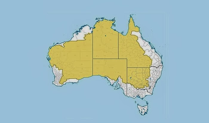
This map shows (in white) where 98 percent of Australia’s population lives.
oooo
It may not come as a surprise but more people live inside the circle than outside of it.
oooo
This map shows what is on the other side of the world from where you are standing. For the most part it will probably be water.
oooo
Apparently you can’t get Big Macs everywhere. This map shows (in red) the countries that have McDonalds.
oooo
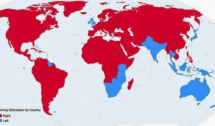
This map shows the countries (in blue) where people drive on the left side of the road.
oooo
This map shows countries (in white) that England has never invaded. There are only 22 of them.
oooo
The line in this map shows all of the world’s Internet connections in 1969.
oooo
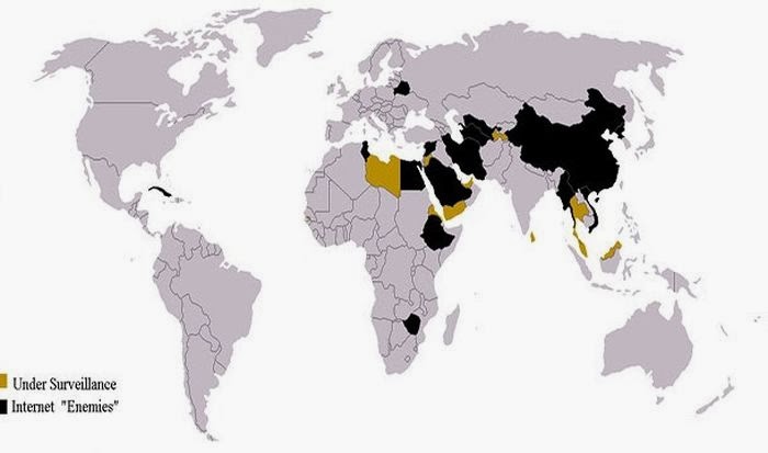
This map shows the countries that heavily restricted Internet access in 2013.
oooo
This map shows (in red) countries that were all Communist at one point in time.
oooo
This map shows (in red) the countries that don’t use the metric system.
oooo
This map shows (in blue) places where Google street view is available.
oooo
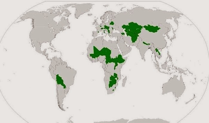
This map shows (in green) all the landlocked countries of the world.
oooo
And this is what the world would look like if all the countries with coast lines sank.
oooo
This is a map of the all the rivers in the United States.
oooo
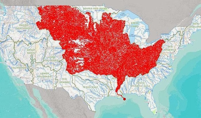
And these are all the rivers that feed into the Mississippi River.
oooo
This is a map of the highest paid public employees in the United States.
oooo
This map shows how much space the United States would occupy on the moon.
Would love to hear which of the maps you found most interesting, and why?
Here – its the rivers flowing into the Mississippi! Who knew!
Personally, I love Ordinance Survey maps because I can imagine the detail of the landscape and being there. 🙂
Again I am with Hariod.. the countries in white that England never invaded… LOL….I knew we had colonised many a country.. And can see how we got the name the British Empire.. 🙂 tables have turned a tad bit now 🙂


“This map shows countries (in white) that England has never invaded. There are only 22 of them.”
That would shock a lot of English people I think Paul.
LikeLike
That was exactly our response when I reviewed today’s post with Jeannie yesterday evening. We were aghast, to be honest!
LikeLike
Fascinating Paul! I love maps too 🙂
LikeLike
Delighted, Val. Did you have a favourite?
LikeLike
Here – its the rivers flowing into the Mississippi! Who knew!
Personally, I love Ordinance Survey maps because I can imagine the detail of the landscape and being there. 🙂
LikeLike
Yes, Jean and I also found that one fascinating. Who would have guessed it!
LikeLiked by 1 person
Again I am with Hariod.. the countries in white that England never invaded… LOL….I knew we had colonised many a country.. And can see how we got the name the British Empire.. 🙂 tables have turned a tad bit now 🙂
LikeLike
One can see the aptness of that old saying, “The sun never set on the British Empire.”
LikeLiked by 1 person
Haha.. Yes.. 🙂
LikeLike
This map shows the countries that don’t use the metric system. A fine example of pig-headed US intransigence.
LikeLike
Oh, well spotted! Plus, a warm welcome to this place.
LikeLike