Tag: NASA

Not of immediate concern!

Milky Way galaxy heading for a collision – in about 4,000,000,000 years!

As with huge numbers of others who come to this blog, the night sky has always been of incredible fascination to me.  To reinforce that fact, one of the favourite posts on Learning from Dogs for the last three years has been The night sky above published back on the 27th March, 2011.  If you haven’t read it, do pop across and do so as the title is misleading in terms of the post.

Thus it was unavoidable not to pick up on an item recently referred to by Naked Capitalism that had been published by the EarthSky blog.  This particular item was called Night sky as Milky Way and Andromeda galaxies merge.  It began thus:

As seen on Cosmos … the collision and merger between our Milky Way galaxy and the nearby Andromeda galaxy 4 billion years from now.

The video below illustrates what NASA scientists announced in 2012 – and what the Cosmos TV series featured in 2014 – that the nearby Andromeda galaxy will collide and merge with our Milky Way galaxy 4 billion years from now. The video (from the Hubble Space Telescope news center) is from a series of photo illustrations, showing the predicted merger between our two titan spiral galaxies, as seen in Earth’s sky. Will Earth as a planet survive long enough to see this? A word about that at the end of this post.

The video lost a lot for me by not carrying a commentary.  But no problem as one was found that did have a ‘voice-over’.  However, the article photographs were stunning.  For example:

merger-milky-way-andromeda-NASA-e1395662599173
This series of photo illustrations shows the predicted merger between our Milky Way galaxy and the neighboring Andromeda galaxy. Via NASA; ESA; Z. Levay and R. van der Marel, STScI; T. Hallas, and A. Mellinger

A description of what’s happening in the images above:

First Row, Left: Present day.
First Row, Right: In 2 billion years the disk of the approaching Andromeda galaxy is noticeably larger.
Second Row, Left: In 3.75 billion years Andromeda fills the field of view.
Second Row, Right: In 3.85 billion years the sky is ablaze with new star formation.
Third Row, Left: In 3.9 billion years, star formation continues.
Third Row, Right: In 4 billion years Andromeda is tidally stretched and the Milky Way becomes warped.
Fourth Row, Left: In 5.1 billion years the cores of the Milky Way and Andromeda appear as a pair of bright lobes.
Fourth Row, Right: In 7 billion years the merged galaxies form a huge elliptical galaxy, its bright core dominating the nighttime sky.

The sequence is inspired by dynamical computer modeling of the inevitable future collision between the two galaxies.

Further on in the article one reads:

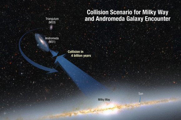
This illustration shows the collision paths of our Milky Way galaxy and the Andromeda galaxy. The galaxies are moving toward each other under the inexorable pull of gravity between them. Also shown is a smaller galaxy, Triangulum, which may be part of the smashup. Via NASA; ESA; A. Feild and R. van der Marel, STScI.

Will Earth survive long enough to see this merger of galaxies, as depicted in the video above? Earth as a planet might, but life on Earth – probably not. Astronomers say that the luminosity, or intrinsic brightness, of our sun will steadily increase over the next 4 billion years. As the sun’s luminosity increases, the amount of solar radiation reaching the Earth will also increase. It’s possible that – around 4 billion years from now – the increase in the Earth’s surface temperature will cause a runaway greenhouse effect, perhaps similar to that going on now on the planet next door, Venus, whose surface is hot enough to melt lead. No one expects to find life on Venus. Likewise, life on Earth will probably not exist 4 billion years from now. What’s more, our sun is expected to become a red giant star eventually. A probable fate of the Earth is absorption by the sun in about 7.5 billion years, after our sun has entered the red giant phase and expanded to cross Earth’s current orbit.

Anyhow, I mentioned that I found a better video on YouTube than the one included in the original article, and that is now presented.

Rather puts the grunt and grind of daily life into perspective! 😉

A very simple notion.

Our beautiful planet.

As is the way of things, two completely disconnected events rang out yesterday, as if in harmony.

The first was this stunning picture released by NASA.

A distant view of home!

The full description may be read here, but I have taken the liberty of republishing this extract:

Earth, which is 898 million miles (1.44 billion kilometers) away in this image, appears as a blue dot at center right; the moon can be seen as a fainter protrusion off its right side. An arrow indicates their location in the annotated version. The other bright dots nearby are stars.

Now it doesn’t take too much imagination to put that minute speck of light, our Planet Earth, into its scale of meaning and importance vis-a-vis the universe.  You get my message, I’m sure.

The second event was a comment left by long-term reader and supporter of Learning from Dogs, Patrice Ayme.  The comment was on yesterday’s post, The meaning of wildness, and I quote:

Excellent article. Clearly primary temperate rain forest, nearly gone everywhere except in the American North west, has to be reintroduced.

Sheep ought not to be removed by man, but be removed by wolf, bear, felids. Cows would feel whole, having to fight off lions. And man’s sense of what nature means, vital to insure our survival, would blossom in this hour of need, when we have arisen as the planet’s gods. gods of evil, or gods of wisdom? That is the most important question.

“gods of evil, or gods of wisdom?”

To everybody I say this.  (And I am most certainly not excluding me.) When you next look at yourself in the mirror will you make a decision?  Will you be a god of evil or a god of wisdom?

Down here, from up there!

The power of mankind’s footprint on Planet Earth.

Last Friday, I published a post under the title of People, people, everywhere! Coincidentally, that same day over on Transition Town Payson‘s blog a post was published Urban Sprawl, a Vision from Space! It seemed like a fitting follow-on to that post on Learning from Dogs and is reproduced with the kind permission of the TTP team (thanks Rob).

oooOOOooo

Urban Sprawl, a Vision From Space!

Posted on by

Urban Sprawl has a major impact on all our Resources!

Urban Sprawl can be tracked

In the Sun Belt Areas of our country, phenomenal growth has occurred over the past 30 years.  Satellite images from 1984 through 2012 show the impacts on the Landscape in a time lapse image that is a scary picture of what the next 30 years may bring.

A blog article from the Atlantic Cities website forwarded to me by my friend Dave H. It is a geographic time lapse of satellite images provided by Google.  Their article titled  “The Devastating Impact of 30 Years of Sprawl, as Seen From Space.” gives startling images of how our cities have grown.

“These GIFs were recorded from Google’s “Landsat Annual Time Lapse” tool by Samuel Aston Williams, a young Texas architect. Williams wanted to contribute something new to a startling series of showing three decades of human-landscape intervention recently produced by a collaboration of Google, NASA, TIME and others.”

Read the full article.

The Atlantic Cities also published a blog titled “A Terrifying, Fascinating Time lapse of 30 Years Impact on Earth.”  The images in this blog shows development in other places on the earth in a scary 30 year blink of an eye.

“Since the 1970s, NASA and the U.S. Geological Survey have been amassing satellite images of every inch of our planet as part of the Landsat program. Over time, the images reveal a record of change: of cities expanding, lakes and forests disappearing, new islands emerging from the sea off the coast of rising Middle East metropolises like Dubai.

If you could thumb through these historic pictures as if in a flip book, they would show stunning change across the earth’s surface, in both our natural environments and our man-made ones. Now, the digital equivalent of that experience is possible – three decades of global change as GIF – in a project unveiled today between NASA, the USGS, TIME, Google, and the CREATE Lab at Carnegie Mellon University.

Landsat images taken between 1984 and 2012 have been converted into a seamless, navigable animation built from millions of satellite photos. As Google wrote this morning on its blog: “We believe this is the most comprehensive picture of our changing planet ever made available to the public.”

See the time lapse images here.

Here’s the Problem!

World Population Growth.

Our Population is only going to Grow Larger!

World population details here.

NASA has also been Following Urban Sprawl

This is how Baltimore has grown in 200 Years!

October 11, 2002:  While space technology was undergoing its spectacular birth during the 1950s and ’60s, and visionaries were predicting the spread of human colonies into space, another kind of human colony was spreading rapidly–right here on Earth!

It was the dawn of the modern suburb, a time of post-war prosperity when housing developments popped up across the landscape like mushrooms after a rain.

A half-century later, we now understand that many environmental problems accompany the outward spread of cities: fragmenting and destroying wildlife habitat, for example, and discharging polluted runoff water into streams and lakes.”

More information here.

Urban Sprawl in the United States is covered in Photos by Christoph Gielen

The photo below was taken by Christoph Gielen.  There is a symmetrical beauty to his aerial photos of Urban Areas.  Please go to his Twisted Sifter website for phenomenal aerial photos of our Urban Centers.

A Great Aerial photo by Christoph Gielen of an Arizona Neighborhood

Urban Sprawl is defined in detail at the Wiki website;

An interesting phenomena is that Sprawl is a term only used in America for Urban Growth,  “The term “sprawl” is most often associated with US land use; outside the US (and especially outside the Anglosphere), the term “peri-urbanisation” is often used to denote similar dynamics and phenomena.”

More on Urban Sprawl.

Urban Sprawl and Public Health?

Smart Growth is the alternative to Urban Sprawl,  unfortunately many people argue against high density living and it is still a contentious point.  Do we continue to grow outward or upward.  Will we feel more like rats trapped in a cage or free range rats. Read the following National Institute of Health article for their take on the impacts of Urban Sprawl vs. Smart Growth.

Urban Sprawl

“Urban sprawl in the United States has its origins in the flight to the suburbs that began in the 1950s. People wanted to live outside of city centers to avoid traffic, noise, crime, and other problems, and to have homes with more square footage and yard space. As suburban areas developed, cities expanded in geographic size faster than they grew in population. This trend has produced large metropolitan areas with low population densities, interconnected by roads. Residents of sprawling cities tend to live in single-family homes and commute to work, school, or other activities by automobile.”

“Although there is considerable evidence that urban sprawl has adverse environmental impacts and contributes to a variety of health problems—including obesity, diabetes, cardiovascular disease, and respiratory disease implementation of policies designed to combat sprawl, such as smart growth, has proven to be difficult.”

Smart Growth

“Smart growth can be defined as a policy framework that promotes an urban development pattern characterized by high population density, walkable and bikeable neighborhoods, preserved green spaces, mixed-use development (i.e., development projects that include both residential and commercial uses), available mass transit, and limited road construction.”

Urban Sprawl, Smart Growth, and Deliberative Democracy

From Wiki these are the Advantages and Disadvantages of Urban Sprawl

Advantages

– More single family residences on larger lots.
– Lower land prices.
– Less experience of noise and pollution.
– Suburban areas generally associated with “sprawl” tend to have lower crime and higher-quality schools.
– Perceived overwhelming consumer preference for sprawl-type developments.

Disadvantages

– High car dependence.
– Inadequate facilities e.g.: cultural, emergency, health, etc.
– Higher per-person infrastructure costs.
– Inefficient street layouts.
– Low diversity of housing and business types.
– Higher per-capita use of energy, land, and water.
– Perceived low aesthetic value

Source: Wikipedia

Our Human Colonies seem to be spreading about as fast as our ice caps are melting.  I wonder if there is any correlation?

Is it time for mankind to adapt to a new future?  No, it’s past time.  We have a lot of catching up to do in implementing new technologies to provide sustainable growth options in all areas; industry, transportation, energy production, carbon footprints, food supply, to taking care of our precious fresh water supplies.

How do we make our cities more sustainable and resilient?  Start with telling your national, state and local politicians that you want a sustainable future.  Let’s work together and make this happen.

Urban Sprawl or Smart Growth, your choice!

Make your world Sustainable!

oooOOOooo

The perils of self-reinforcing arguments.

Professor Mark Cochrane’s perspective on ‘certainty’!

I’m an avid follower of Mike Stasse’s blog Damn the Matrix.  So it was rather fortuitous that two days ago there was a guest post on Mike’s blog from Mark Cochrane. Dr. Mark Cochrane is a Senior Scientist and Professor at South Dakota State University where one can read:

Dr. Mark Cochrane conducts interdisciplinary work combining ecology , remote sensing, and other fields of study to provide a landscape perspective of the dynamic processes involved in land-cover change. He is an expert on wildfire, documenting the characteristics, behavior and severe effects of fire in tropical and temperate forests that are inherent to current systems of human land-use and management. His research focuses on understanding spatial patterns, interactions and synergisms between the multiple physical and biological factors that affect ecosystems. Recently published work has emphasized the climate change, human dimensions of land-cover change and the potential for sustainable development.

The guest post was called Doom and Denial two sides of the same coin; I’m extremely grateful to Mike Stasse for granting me permission to republish the essay.

oooOOOooo

Doom and Denial two sides of the same coin.

19th June 2013

Another guest post by Mark Cochrane……  and I hope Guy reads this, I’d like his feedback, no pun intended!
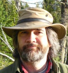
Mark CochraneMark Cochrane

I’ve been asked by several people to address the take of climate ‘doomists’ like McPherson and indicate how my views on what the science indicates differ. First, let me just say that my differences with the doomist views are similar to my differences with the ‘denialist’ views, namely one of actually examining the scientific findings and concluding what they signify versus beginning with a conclusion and looking for evidence to support a pre-concluded viewpoint.

Appropriate use of science (or any information), requires weighing anything being newly reported against the rest of the accumulated evidence on a subject (e.g. climate change) that we have amassed, to date, and using this knowledge to infer the most probable meaning and significance. How credible is the source, how relevant are the results to the larger question, do the new results substantially change our previous understanding? If someone is presenting new ideas that claim to massively shift what we think we know about the world, have they been vetted (e.g. peer-reviewed), do they adequately explain how their new claims better explain observed phenomena than previous studies did and also detail why previous explanations were somehow erroneous? If the results are truly stunning, can they be replicated by others? Although some may find it hard to believe, there is a lot of space between climate denial and climate doom.

I’ve only seen the one talk now by McPherson but where the ‘we are doomed and soon’ meme falls apart is on general logic. You cannot say, there are positive feedbacks A, B and C, therefore life on Earth is suddenly going to end without considering:

  1. what are the current rates of those feedbacks,
  2. what is the rate of change for the feedback,
  3. what is the area affected by the feedback,
  4. what natural limits exist for the feedback,
  5. what negative feedbacks might occur in response?

If you listen to McPherson’s talk, what you get is a litany of disturbing findings, especially feedbacks, and then an expectation that you must reach the same conclusion that we are doomed, and soon. If someone would like to outline the chain of logic used, I’d be happy to discuss it. Even if you accept the chain of logic though, where, in any of it, is there evidence for the timeline being suggested?

Guy McPherson

There is considerable amount of concern about the feedbacks in the Arctic, with good reason, but people do things like linking the large amount of carbon stocks in the Arctic with rapid warming, with increased rates of release, with increased rates of warming……with the obvious end of all life on Earth – near-term extinction!

As anyone who has followed this thread knows, I am usually the one pointing out feedbacks and how most are not even included in current climate projections, in contradiction to those who claim such dire projections are all because of such feedbacks (which ‘skeptics’ claim don’t exist). This does not mean though that the existence of feedbacks means that we can then make the leap to a runaway greenhouse that will soon lead us to having the climate of Venus (atmospheric acid bath at temperatures that would melt lead). Perhaps providing some perspective on the recent material posted about the NASA CARVE project and what it means for all of that carbon in the (not so) permafrost will help.

As NASA recently reported (site),

“Over hundreds of millennia, Arctic permafrost soils have accumulated vast stores of organic carbon – an estimated 1,400 to 1,850 petagrams of it (a petagram is 2.2 trillion pounds, or 1 billion metric tons). That’s about half of all the estimated organic carbon stored in Earth’s soils. In comparison, about 350 petagrams of carbon have been emitted from all fossil-fuel combustion and human activities since 1850. Most of this carbon is located in thaw-vulnerable topsoils within 10 feet (3 meters) of the surface.”

“Permafrost soils are warming even faster than Arctic air temperatures – as much as 2.7 to 4.5 degrees Fahrenheit (1.5 to 2.5 degrees Celsius) in just the past 30 years,” Miller said. “As heat from Earth’s surface penetrates into permafrost, it threatens to mobilize these organic carbon reservoirs and release them into the atmosphere as carbon dioxide and methane, upsetting the Arctic’s carbon balance and greatly exacerbating global warming.”

In other words, there is 4-5 times as much carbon sitting around in those frozen soils as we have already emitted that are becoming increasingly vulnerable to being thawed out for a portion of each year.

Once those soils thaw they become accessible to microorganisms that feed on the incompletely decomposed plant materials that they contain. If there is sufficient oxygen (warm relatively dry Arctic) the process is faster and the product is CO2, if the process is anaerobic (warm relatively wet Arctic), then the product is methane.

So warming leads to thawing, thawing leads to microbial decomposition, and microbial activity leads to carbon emissions. These emissions are a positive feedback that makes the current process of greenhouse gas warming worse since each degree of warming yields more greenhouse gases that speed up the warming process further. This is where the message of doom goes off the tracks and extrapolates erroneously that this somehow means that all of that carbon is going to suddenly find itself in the atmosphere.

Three meters (10ft) of soil carbon doesn’t just suddenly evaporate into the atmosphere in the next few years. Thawing permafrost is not synonymous with melting carbon.  Even once permafrost melts, it is still very cold. However, bacteria can start digesting it – until it freezes again. Melted permafrost does not mean permanently melted. The surface layer of the Arctic lands are already in the active layer that temporarily thaws each year and then refreezes. Now, we are making more of the Arctic soil active to greater depths and at higher latitudes. This means that there will be more emissions from those soils.

Taken out of context snippets like this (below) from that NASA press piece can be made to sound catastrophic.

“Some of the methane and carbon dioxide concentrations we’ve measured have been large, and we’re seeing very different patterns from what models suggest,” Miller said. “We saw large, regional-scale episodic bursts of higher-than-normal carbon dioxide and methane in interior Alaska and across the North Slope during the spring thaw, and they lasted until after the fall refreeze. To cite another example, in July 2012 we saw methane levels over swamps in the Innoko Wilderness that were 650 parts per billion higher than normal background levels. That’s similar to what you might find in a large city.”

Parsing the quote, please note that “episodic bursts of higher-than-normal carbon dioxide and methane” in two locations (regions) does not mean the end is nigh. Higher-than-normal is just that, but how much higher and how long did it last? The scientists are saying that the observations do not match existing ‘models’ (models are wrong, a favorite meme), it doesn’t mean that such events haven’t been happening up until now (only that we didn’t know about them). As for the 650ppb increase over a swamp, that equates to being 1/3 higher than the background level. Methane and swamps go together so some higher level is to be expected. The question is if and by how much 650ppb is higher than it would have been back around 1980 or so? If it used to be 10ppb higher than background then you have a big change (640ppb), however, if it used to be 640ppb, then not so much (10ppb difference). Even if that is all new carbon being emitted, the local change becomes very small when diluted globally. The point here is not to poo-poo the findings or the scientist’s work, they are doing very important stuff (!), it is to provide context.

Just how bad could things be? I do not work in the high Arctic but I do work in similar organic soils in the tropics (peat swamps) where, because of intentional draining, the several meter thick peat layer that is ‘active’ is increased in an analogous manner to the effects of melting permafrost. Microbial degradation is occurring, with the difference that the temperature is very warm instead of being very cold. Think of how fast fruit spoils in your refrigerator versus on a hot window sill. In these tropical peat soils we see large amounts of CO2 coming off into the atmosphere each year now, but even with such large rates of loss, this equates to taking about 20-25 years to lose 1 meter of organic soil. In the Arctic the microbial degradation will be much slower due to the relatively low temperatures. This doesn’t mean that it is not important. Slow rates of emissions over a large area is still a lot of extra carbon going into atmosphere but this is a problem that is going to take centuries to play out, not less than a decade. It makes things worse but it doesn’t suddenly end life on Earth.

Incidentally, all of that soil carbon in the Arctic isn’t a uniform petri dish either. Some of that carbon is easier to access by bacteria than other portions. Emissions will rise quickly as the bacteria chew through the cellulose, for example, but things like lignin get left behind. The point being that even for a given mass of carbon in the ‘active’ layer, there will be a dampening of the emissions growth rate as the quality of the bacteria buffet goes down when it gets picked over.

I do not pretend to know what the motivations of ‘doomists’ are, whether it be honest despair or simple misunderstanding but they are conveying the same message of do nothing as those who deny the existence or importance of climate change. Denial = don’t worry be happy, while Doom = don’t worry, you can’t do anything about it anyway. Both viewpoints are wrong in trying to turn climate change into a false dichotomy of either fantasy or inevitability. Both the science and our choices are much more complicated. It’s uncomfortable but your choices do matter now and for generations to come. There is no ‘fixing’ things at this point but you still have the ability to choose how you react to the predicament we have created. Doom and denial are respectively trying to tell you that you either have no choice or no need to choose. But, as Philip K. Dick wrote:

“Reality is that which, when you stop believing in it, doesn’t go away.”

oooOOOooo

Dog or human?

This second offering from Dan is very different to yesterday’s deep space theme.

Yesterday, I published an item sent in by Dan that included a video of an area of deep space photographed by the Hubble Space Telescope.  Do take a look if you missed it yesterday – it is truly astounding.

Today, something from Dan that is altogether much more pragmatic, albeit very funny.  Enjoy!

Very, very long odds!

Looks like being a Dan Gomez weekend.

Dan sent me an email with a link to a most astounding video.  But before we get to that, just take a look at these images.  Here are the first three from the set of eight.

Eight breathtaking images of baby stars

MNN1

1. Beautiful newborns

In a universe of fantastic images, a newborn star is a mystical masterpiece. Cradled within the dusty arms of a nebula, a baby star seems to blink its way to a new life. The lifespan of a star is a series of sequences. A star may spend most of its life in a “main sequence phase” where nuclear fusion of hydrogen into helium is happening in its core. But before this happens, it lives as a protostar, or baby star.

Thanks to NASA’s advanced infrared space telescopes such as Hubble and Spitzer, we are able to view these star births as never before. Pictured here are newborn stars peeking out “from beneath their natal blanket of dust” in the Rho Ophiuchi dark cloud as seen by the Spitzer Space Telescope. (Text: Katherine Butler)

MNN2

2. Young stars in Serpens

Here the Spitzer Space Telescope reveals the Serpens South star cluster, in which 50 or so young stars exist. They are seen as the “green, yellow, and orange-tinted specks sitting atop the black dust lane.” A supernova or galaxy collision can cause a star to form when huge clouds of hydrogen and helium collapse under mutual gravity. As the cloud collapses, it heats up and starts to spin. Since protostars are covered in dust, they can be seen only through infrared telescopes like Hubble and Spitzer. As Universe Today writes, “After about 100,000 years or so, the protostar stops growing and the disk of material surrounding it is destroyed by radiation.” Then this star, now called a T Tauri or pre-main sequence star, is visible from Earth.

MNN3

3. Bubbly little star

We are used to images of babies blowing bubbles, and it looks like the infants of the cosmos do the same. This image, taken by the Spitzer Space Telescope, shows the HH 46/47 baby star blowing bubbles into space via powerful jets of gas. Located about 1,140 light-years from Earth, HH 46/47 is the bright white star at the middle of the image. Two bubbles reach out in opposite directions and are formed when the jets collide with the dust and gas surrounding the star. As Universe Today reports, “Astronomers think that young stars accumulate material by gravitationally pulling in gas and dust. This process ends when the star gets large enough to create these jets. Any further material is just blown away into space.”

Go and view the remaining five stunning images here.

Now to what was sent by Dan.

Check out this mind-bending video that talks about the “Hubble Ultra Deep Field” image captured by NASA astronomers nearly a decade ago — a photograph that some call “the most important image ever taken.”

It all started back in 1996 when a group of astronomers pointed the Hubble Space Telescope at an empty patch in the sky close to the Big Dipper in hopes of seeing something, anything. At the time, it was considered to be a risky move, given that demand for use of the telescope was so high. What if the experiment yielded no results? What if nothing but an empty image was the final result?

After ten full days of exposing the telescope’s CCD camera sensor to this seemingly vacuous patch of sky, a breathtaking image was produced. Over three thousand galaxies appeared in one image — some as dots, others as spirals. It was a visual reminder of just how big our universe really is. The photo is called the “Hubble Deep Field“:

A Mind Bending Look at the Hubble Ultra Deep Field Photo of the Universe hdf

In 2004, astronomers pointed Hubble near constellation Orion and opened the shutter for a whopping 11 days. Using sensitive detectors and specialized filters, the telescope was able to capture an image with over 10,000 galaxies. This image became known as the “Hubble Ultra Deep Field.”

A Mind Bending Look at the Hubble Ultra Deep Field Photo of the Universe hudf

Scientists later used redshift calculations of the galaxies to turn the photograph into a “fly-thru” view of the photo:

It didn’t end there. Last year, NASA scientists created the Hubble Extreme Deep Field, which has an equivalent exposure time to 23 days and features. It’s the “deepest image of the sky ever obtained” that reveals “the faintest and most distant galaxies ever seen”:

A Mind Bending Look at the Hubble Ultra Deep Field Photo of the Universe deepest

And just think: scientists created these photos by pointing their mega-camera at a tiny speck of the night sky that appears to be completely devoid of visible stars!

oooOOOooo

… a tiny speck of the night sky that appears to be completely devoid of visible stars!

Dan said in his email, “Are we really here?  What are the chances?”

You really have to wonder!  Incredibly long odds.  Both to us being here and to us being the only conscious, intelligent species in the universe.

Dr. James Hansen

The full copy of an email received yesterday from 350.org

Support the Cause
Support the Cause

Breaking news about a good friend

Dear friends,

Big news has just emerged: Dr. James Hansen, the planet’s premier climate scientist, announced his retirement as head of NASA’s Goddard Institute of Space Studies, where he began his career in 1967.

If 350.org has a patron saint, it’s Jim. It was his 2008 paper that gave us our name, identifying 350 parts per million CO2 as the safe upper limit for carbon in the atmosphere.

But as much as for his science, we respect him for his courage. He’s always been willing to speak the truth bluntly, from the day in 1988 when he told Congress that the time had come “to stop waffling so much and say the planet was warming,” to all he’s done to bring attention to damaging projects like Keystone XL — even to the point of risking arrest to do so. I have no doubt he’ll go on doing science, and speaking plainly — indeed, he told the New York Times that one reason he’s leaving the federal payroll is so he can take on the government more directly.

But this is a big moment, and we need to mark it. Here’s what I hope you’ll do: honor Jim’s lifetime of work by making a public comment to the State Department about Keystone XL and tell them to reject the pipeline. In this case, speaking out is simple — click the link below to go to the page to submit from. There’s a list of ten arguments to choose from – you can mix and match or put it in your own words and just speak from the heart.

Click here to submit your comment: act.350.org/letter/a_million_strong_against_keystone/

Sending a message to the State Department might not seem like much, but I think it’s actually quite fitting tribute.

One reason we’re fighting the pipeline is because Jim Hansen did the math to show that if we combusted the tar sands on top of all else we burn, it would be “game over for the climate.” So far that message hasn’t gotten through: the State Department hired a bunch of compromised oil industry analysts to ‘review’ KXL, and unsurprisingly they decided it would have ‘minimal’ environmental impact. We need to get them to take reality seriously, and change that assessment.

Maybe — just maybe — with a truly overwhelming flood of comments, we can break through. Together with our friends across the movement, we’re aiming for an ambitious target of 1 million comments to the State Department to stop the pipeline.

Beginning this comment push is all the more timely after the disasterous tar sands pipeline spill in Arkansas, where thousands of gallons of toxic oil ran freely through the streets of a suburban community. 

Jim Hansen has been to jail twice to try and block KXL. When I saw him in handcuffs, I cringed. I don’t mind going myself, but it seems crazy that we have to send our best climate scientist off in handcuffs; in a sane world he’d never have to leave the lab. And in a sane world we’d just be toasting his retirement from NASA with well-deserved champagne.

But it’s a crazy world, heating fast, and so we need to mark this historic day in a way that really counts. Please do take a couple minutes to submit a comment on the Keystone XL Pipeline.

So many thanks,

Bill McKibben

P.S. This article about Jim’s work in the New York Times is supurb — please take a moment to read and share: nytimes.com/2013/04/02/science/james-e-hansen-retiring-from-nasa-to-fight-global-warming.html

oooOOOooo

P.S. please submit your comment re the Keystone XL Pipeline; for all our sakes.  This is the acknowledgement you will receive from 350.org.

Hey,

Thanks for submitting your comment. We’ve set the ambitious goal of 1,000,000 comments to the State Department because our best defense against the big money behind this project is overwhelming numbers — in short, people power.

Submitting a comment is just the first step — to hit that big goal, we each need to get our friends, family and maybe a few new people to join us. The next step is to share this with your social networks. You can click below to easily share with Facebook and Twitter:

Click here to share on Facebook

Click here to tweet

Also, emails to friends is a great way to encourage people to share as well — just include this link when you reach out:act.350.org/letter/a_million_strong_against_keystone/

No doubt we’ll talk again soon about all this — there’s still a ways to go.

Duncan

Just a small, white dot!

Does rather serve to remind us of our place in the scheme of things.

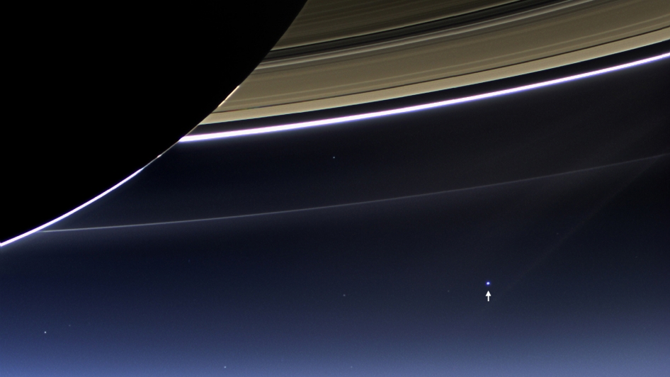
This stunning image was taken by the Cassini-Huygens probe.  Many of the images taken by NASA are available for download from the DVIDS website, which is where this one was found. (But also do visit the Ciclops website.)

The title of the photograph is:

A View of Earth from Saturn

A View of Earth from Saturn: Image of the Day

Although the Earth Observatory typically reserves ”Image of the Day” space for publishing data and images acquired by Earth-observing satellites, we are sometimes so enthralled by the spectacular images acquired by spacecraft observing other parts of the solar system that we want to share these ‘otherworldy’ views with our visitors. And if you are looking for remotely sensed images of the Earth, this view is the most remotely sensed image we have ever published!

This beautiful image of Saturn and its rings looks more like an artist’s creation than a real image, but in fact, the image is a composite (layered image) made from 165 images taken by the wide-angle camera on the Cassini spacecraft over nearly three hours on September 15, 2006.

Scientists created the color in the image by digitally compositing ultraviolet, infrared, and clear-filter images and then adjusting the final image to resemble natural color. (A clear filter is one that allows in all the wavelengths of light the sensor is capable of detecting.) The bottom image [the one above. Ed.] is a closeup view of the upper left quadrant of the rings, through which Earth is visible in the far, far distance.

On this day, Saturn interceded between the Sun and Cassini, shielding Cassini from the Sun’s glare. As the spacecraft lingered in Saturn’s shadow, it viewed the planet’s rings as never before, revealing previously unknown faint rings and even glimpsing its home world. Seen from more than a billion kilometers (almost a billion miles) away, through the ice and dust particles of Saturn’s rings, Earth appears as a tiny, bright dot to the left and slightly behind Saturn.

Although it might appear that Earth is located within Saturn’s outermost rings, that positioning is just an illusion created by the enormous distance between Cassini and Earth. When Cassini took this image, the spacecraft was looking back at Saturn from a distance of about 2.2.million kilometers (about 1.3 million miles). The Sun was millions of additional miles beyond, hidden behind Saturn. On September 15, Earth’s orbit had brought our home planet to a location slightly behind and to the left of the Sun from Cassini’s perspective. The Website of the Cassini Imaging Central Laboratory for Operations (CICLOPS) provides more detailed information about this image. The Cassini-Huygens mission is a cooperative project of NASA, the European Space Agency, and the Italian Space Agency.

Trying to find that faint image of Planet Earth in the above photograph is a challenge, even for those with much younger eyes than mine.

However, with a little bit of jiggery-pokery I was able to crop and enlarge the photograph, see below:

saturn

Planet Earth is in the ’10 o’clock’ position in the photograph, about half-way from the centre of the enlarged segment towards the top-left corner of the picture, just outside the outer white ring.

That’s us. All that we have ever been. All that we ever will be. Just that small white dot.

DA14

Not such a bizarre post title as you might think!

asteroid-2012-da14-art

DA14, or to give it’s full name, Asteroid 2012 DA14, is calling by Planet Earth rather soon.  To quote the item on the Planetary Society’s website,

Asteroid 2012 DA14 Discovery Enabled by Planetary Society Grant

On Friday, February 15, 2013, Asteroid 2012 DA14 will travel just 17,000 miles above the Earth – closer to our planet than the orbit of the communications satellite that broadcast the Super Bowl around the world. About half the size of a football field and with more than 100 times the energy impact of the nuclear bomb that fell on Hiroshima, DA14 will miss Earth this time around, but if it had impacted, this asteroid could have taken out any major metropolitan city on our planet.

The discovery of Asteroid DA14 was made by a small team of observers at La Sagra Observatory in Southern Spain, on February 22, 2012, enabled with a grant provided by The Planetary Society. One of the observatory’s telescopes had recently been upgraded with funds donated by The Planetary Society’s NEO Shoemaker Grant program. Its new camera enabled detection of fast moving objects like 2012 DA14 – requiring very fast imaging for discovery and determination of their paths. The upgraded instrument has far outperformed the Observatory’s other telescopes.

Now, we get to point the world’s telescopes at this 2013 close flyby and learn more about this asteroid and its orbit because of the support of our Planetary Society Members all over the world.

This asteroid won’t hit Earth, at least for many, many decades.  But it is a reminder we live in a cosmic shooting gallery.  We need to find, track, and characterize these objects and develop the technical and political capability to deflect an asteroid.  It is not a matter of whether there will be a dangerous impact, it is a matter of when.

The Planetary Society and its members are working to do our part through programs like ourShoemaker NEO Grants, like the one that made the discovery of 2012 DA14 possible, and projects like Laser Bees, exploring new ways to potentially deflect a dangerous asteroid.

NASA have recently released a video, see below, but a search on YouTube will find more, some of which are more engaging than the rather dry style of the NASA release.


Have questions?  Bet you do!  Here are some of the answers to the obvious ones.  Including these:

What is the time of closest approach

Feb. 15, 2013, 19:25 UTC (11:25 PST)

What is the closest approach altitude?

Approximate altitude above the surface of the Earth will be 27,330 km, 17,000 mi (34,100 km, 21,200 mi from center of Earth).  That is closer than the altitude of geosynchronous satellites, e.g., satellite TV satellites, at 35,786 km (22,236 mi) altitude.

Will it be visible with the naked eye, how bright will it be?

It will not be a naked eye object.  At closest approach, its brightness will be about a magnitude of 7.  It will be bright enough that it could be seen with steady binoculars or a small telescope if you are on the side of Earth it will be passing.

What parts of Earth will have a chance to observe it telescopically?

Near closest approach when it is brightest, most of Europe, Asia, and Africa.  It will pass from the southern hemisphere to northern hemisphere.  Though it will be much dimmer, it is observable by larger telescopes for days to weeks before and after closest approach.

Finally, well done those gents that first spotted DA14.

Miguel Hurtado, Jaime Nomen, and Jaume AndreuWinners of a Planetary Society Shoemaker NEO Grant in 2010
Miguel Hurtado, Jaime Nomen, and Jaume Andreu
Winners of a Planetary Society Shoemaker NEO Grant in 2010

Now where did I put my tin helmet?

Plus ça change – sequel

Plus ça change, plus c’est la même chose (“the more it changes, the more it’s the same thing”).

As I wrote yesterday, “… out of curiosity I wondered what I had published a year ago, in early February 2012.  To my amazement what was published was as fresh and relevant as if it had been published today.

So here’s the second part of that trilogy of posts from February, 2012.  (It reads in its original form with the links and references unchanged.)

oooOOOooo

Climate, truth and integrity, part two

Continuing from Part One last Friday.

Last Friday I started re-publishing the wonderful comments that had appeared on Climate Sight in response to a question that I had raised, namely,

While in every way that I can think of, I support the premise of mankind affecting global climate, I would love to hear from someone who could reconcile the Post above with these recent items:” and then included the links to the WSJ and Daily Mail items.

If you are not familiar with those WSJ and Daily Mail items, then you will need to go back to Friday’s Post.

So moving on.

The third response was from chrisd3, here’s what he wrote,

Paul, here is the Met Office’s response, which begins, “[The Daily Mail] article includes numerous errors in the reporting of published peer reviewed science undertaken by the Met Office Hadley Centre and for Mr. Rose to suggest that the latest global temperatures available show no warming in the last 15 years is entirely misleading.”

Here is Deltoid taking David Rose apart on some earlier pieces:

And NASA never said anything about the Thames freezing over. Rose just made that bit up.

Finally, here is a chart of global temps from HadCRU:

From this, it is pretty clear why Rose chooses 15 years as his starting point: 1997-1998 was the time of the largest El Nino ever recorded, resulting in a huge temperature spike. Using that as the starting point for a temperature comparison is absolutely classic cherry-picking.

And in any event, you can’t say anything about trends in noisy data by simply comparing two arbitrary points. That is not a valid way to analyze the data (especially if you pick an obvious outlier as your starting point!). It is like trying to say whether the tide is coming in or going out by looking at the height of two waves. It just doesn’t work that way. You have to look at the long-term trend to remove the noise.

Let me take you to that Met Office response (and I’m republishing it in full).

Met Office in the Media: 29 January 2012

Today the Mail on Sunday published a story written by David Rose entitled “Forget global warming – it’s Cycle 25 we need to worry about”.

This article includes numerous errors in the reporting of published peer reviewed science undertaken by the Met Office Hadley Centre and for Mr. Rose to suggest that the latest global temperatures available show no warming in the last 15 years is entirely misleading.

Despite the Met Office having spoken to David Rose ahead of the publication of the story, he has chosen to not fully include the answers we gave him to questions around decadal projections produced by the Met Office or his belief that we have seen no warming since 1997.

For clarity I have included our full response to David Rose below:A spokesman for the Met Office said: “The ten year projection remains groundbreaking science. The complete period for the original projection is not over yet and these projections are regularly updated to take account of the most recent data.

“The projections are probabilistic in nature, and no individual forecast should be taken in isolation. Instead, several decades of data will be needed to assess the robustness of the projections.

“However, what is absolutely clear is that we have continued to see a trend of warming, with the decade of 2000-2009 being clearly the warmest in the instrumental record going back to 1850. Depending on which temperature records you use, 2010 was the warmest year on record  for NOAA NCDC and NASA GISS, and the second warmest on record in HadCRUT3.”

Global average temperatures from 1850 to 2011 from the three individual global temperature datasets (Met Office/UEA HadCRUT3, NASA GISS and NOAA NCDC)

Furthermore despite criticism of a paper published by the Met Office he chose not to ask us to respond to his misconceptions. The study in question, supported by many others, provides an insight into the sensitivity of our climate to changes in the output of the sun.

It confirmed that although solar output is likely to reduce over the next 90 years this will not substantially delay expected increases in global temperatures caused by greenhouse gases. The study found that the expected decrease in solar activity would only most likely cause a reduction in global temperatures of 0.08 °C. This compares to an expected warming of about 2.5 °C over the same period due to greenhouse gases (according to the IPCC’s B2 scenario for greenhouse gas emissions that does not involve efforts to mitigate emissions).  In addition the study also showed that if solar output reduced below that seen in the Maunder Minimum – a period between 1645 and 1715 when solar activity was at its lowest observed level – the global temperature reduction would be 0.13C.

Back to that response from chrisd3.  He offered this, “Finally, here is a chart of global temps from HadCRU.”  Here is that chart, remember we are looking at Global temperatures.

Global temperature trend

OK, between this Post and my Post last Friday, you probably get the message!  There were many other contributions and I could go on and on quoting the great responses I got, all of them uniformly saying there IS global warming unprecedented in recent years.  The message is crystal clear and those who wish to deny the evidence … well, I can’t come up with a polite term, so will just leave it at that!

My final contribution is from Martin Lack, author of the Blog Lack of Environment, and a good friend of Learning from Dogs.  Here is what he wrote in a recent email,

You may have seen my latest response to How much is most?

When I eventually saw your earlier comment, I was surprised and disappointed in equal measure because I almost feel that I have failed in some way. Let me explain:  Unlike ClimateSight and SkepticalScience, which both do an excellent job of focusing on the science of climate change, my blog is deliberately focused on the politics underlying the denial of all environmental our problems; including 2 key aspects to my MA dissertation, namely the political misuse of scepticism; and the psychology of denial.  See my How to be a Climate Change ‘Sceptic’  for more detail.

Therefore, although not specifically categorised as such, just about everything I have posted is traceable back to Paul and Anne Ehrlich’sBetrayal of Science and Reason (1996) and/or Naomi Oreskes and Erik Conway’s Merchants of Doubt (2010).  For someone who does not currently go to any Church, I am remarkably fond of quoting Scripture so, if necessary, please forgive me but, as the Good Book says:  “What has been will be again, what has been done will be done again; there is nothing new under the sun” (Ecclesiastes 1:9).

Therefore, I do not think you should be surprised by the amount of misinformation and misrepresentation contained in the original WSJ Sixteen’s article; and/or the fact that denialist arguments are repeated no matter how many times they have been shown to be false.  Furthermore, I would warn against trying to summarise it all on Learning from Dogs.  This is definitely Book territory and, in addition to the two mentioned above, the market is already saturated by the likes of Climate Change Cover-up by James Hoggan and Climate Change Denial by Haydn Washington and John Cook.

With very best wishes for a fog-free future,

What to say to close these two Posts off?  Frankly, it’s difficult to know how to pitch it.  The science seems clear beyond reasonable doubt.  But if you are reading this and disagree, then PLEASE offer the science to refute the conclusions presented here.  I promise you that I will present it on Learning from Dogs.

So let me end with a simple photograph.

Earthrise

This is the photograph that wilderness photographer Galen Rowell called, “the most influential environmental photograph ever taken.”

The now world-famous photograph was taken by Astronaut William Anders from Apollo 8, the first manned mission to the Moon, a little over 43 years ago on December 24th, 1968.

As the Earth rose above the horizon of the moon, NASA astronaut Frank Borman uttered the words, “Oh my God! Look at that picture over there! Here’s the Earth coming up. Wow, is that pretty.”  Bill Anders then took the ‘unscheduled’ photograph.

Now project forward 43 years to the year 2055 and play with the idea of what ‘pretty‘ planet Earth will be like for mankind and so many other species, including our longest companion, the dog, if we don’t get our act together pretty soon!